Case Study — Mobile Product
S
Saif Khan
Product Designer
·
2026
·
Mobile App
Role
Product Designer
Scope
Research · UI · Prototyping
Platform
iOS App
Year
2026
Screens shipped across light and dark
End-to-end, from research to prototype
Task success in moderated testing
Average beta rating
Fig. 1 — Outcomes at the end of the eight-week build.
Premise. Every interaction was rebuilt from the ground up — calmer surfaces, sharper hierarchy, and a single source of truth for every flow.
Scope. Twenty-four interviews, six journeys, and three design rounds — resolved into four core surfaces and a tokenized system that ships light and dark in lockstep.


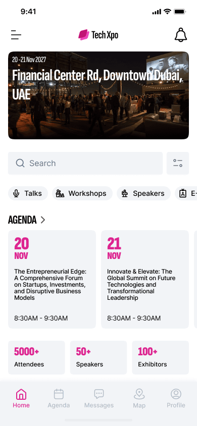
Fig. 2 — The redesigned app across three core surfaces.
01 — Discovery
Curated talks, demos and meetups, ranked by what you actually care about — so the schedule starts from intent rather than from a list of everything happening at once.
02 — Agenda
Build a schedule that respects walking time, breaks, and conflicts — automatically. The agenda resolves collisions as they appear instead of leaving them for the attendee to notice.
03 — Network
One tap turns a conversation into a contact, a calendar invite, or a follow-up note, so the momentum of a hallway introduction survives the rest of the day.
04 — Wayfinding
Indoor positioning that quietly gets you from keynote to coffee in seconds, surfacing direction only when the route actually changes.


Fig. 3 — Discovery, agenda, network, and wayfinding as shipped.
05 — Design System
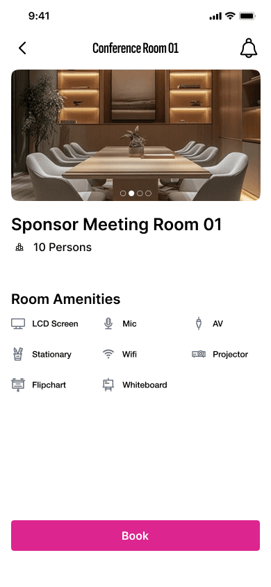
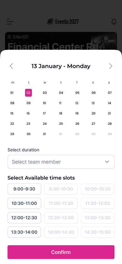
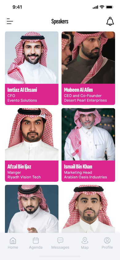
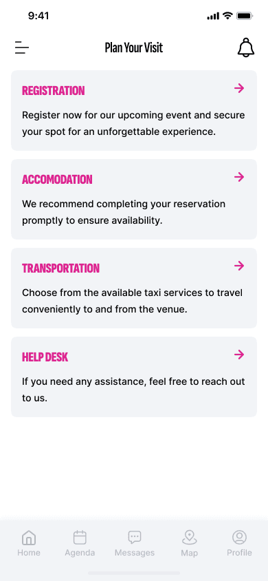
Tokenized from day one — light and dark were designed in lockstep, not as an afterthought. Every surface, border, and type ramp resolves from the same token set, which is why 120+ screens hold together across both themes.
Light
24 of 120+ screens






Dark
16 of 120+ screens


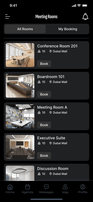
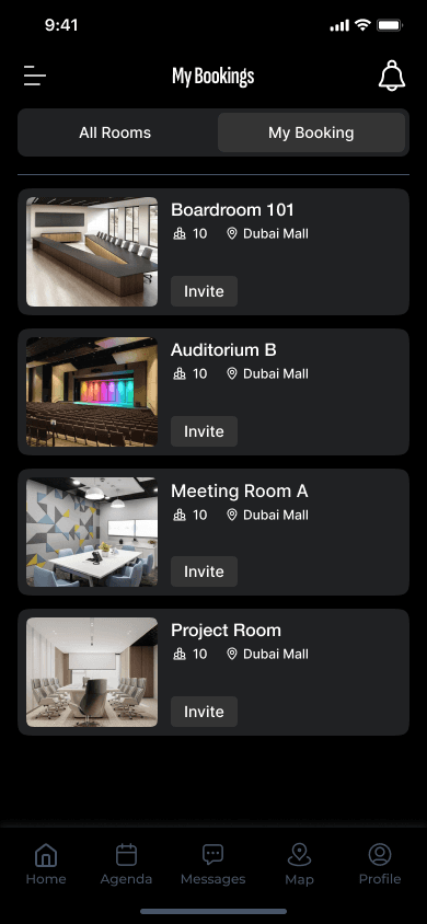


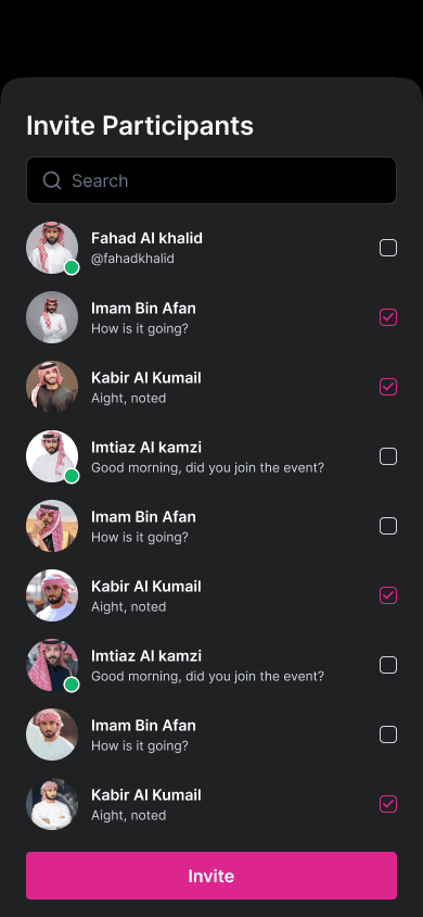

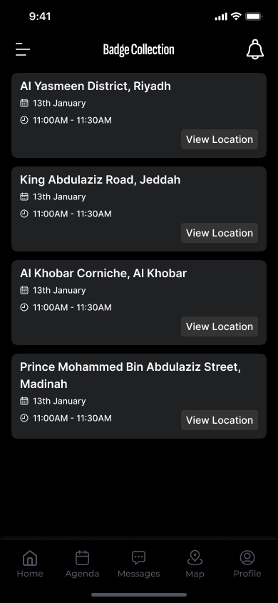


Fig. 4 — Screen walls, light and dark. Scroll each row to browse the set.
06 — Process
Four phases, each closing before the next began — so every screen that shipped could be traced back to something an attendee actually said.
01
Research
24 interviews. 6 journeys. One clear north star.
02
Define
Principles, priorities, and the things we wouldn’t ship.
03
Design
Three rounds. From paper to pixel-perfect prototypes.
04
Validate
Tested with 18 users. 92% completed core flows.
07 — In Practice